ABOUT WEGOJIM
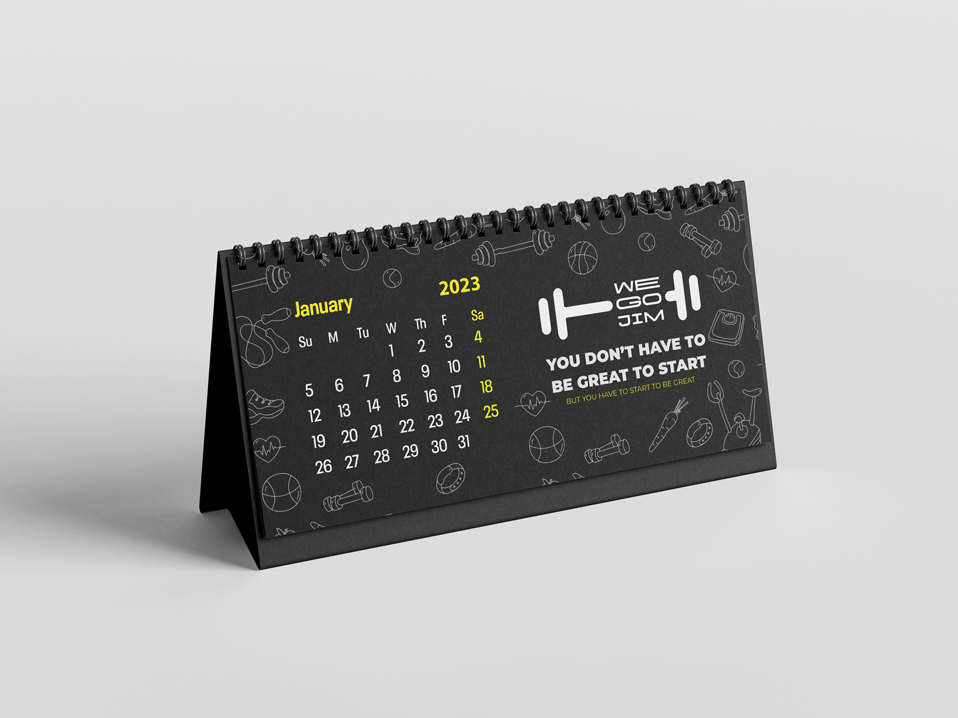
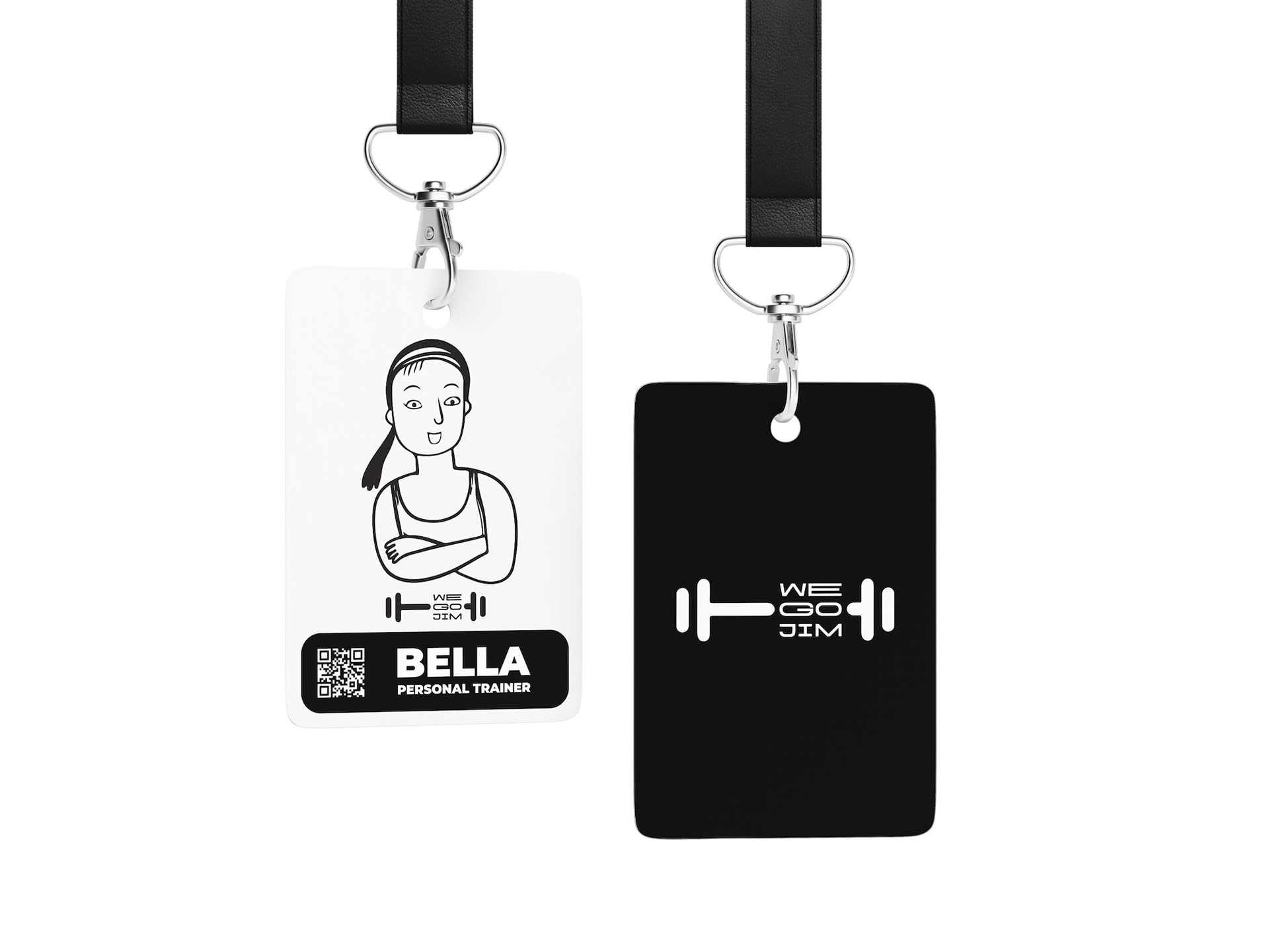
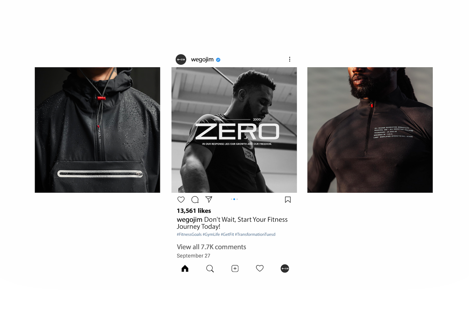
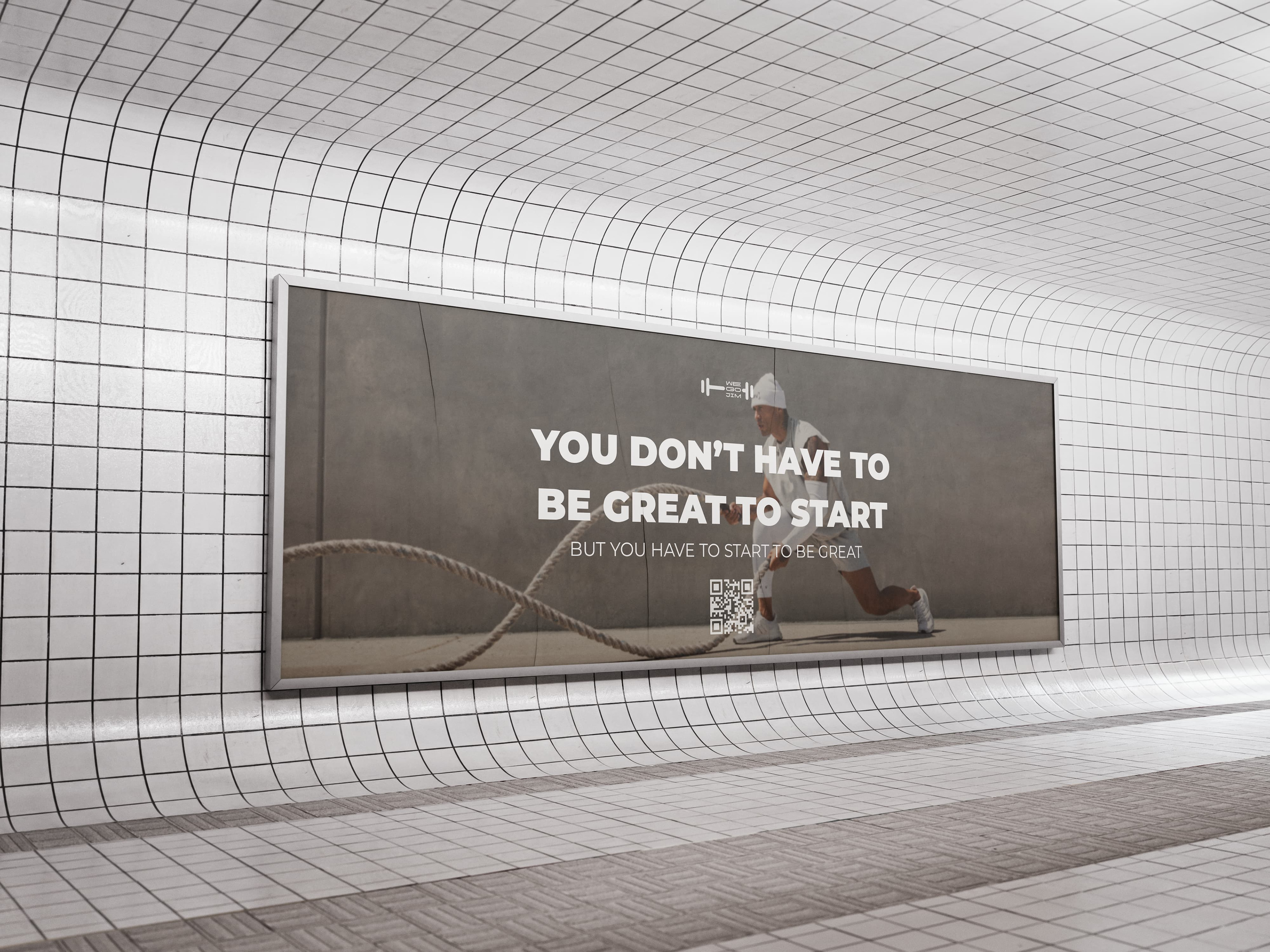
"WEGOJIM" is a modern gym designed for those committed to self-improvement. The name, a deliberate play on the internet-popularized mispronunciation "jim" for "gym" often used humorously by fitness influencers, reflects our understanding of the fitness community's culture and our lighthearted yet dedicated approach. With a fresh, dynamic atmosphere, we welcome everyone—whether you're just starting your fitness journey or pushing your personal limits. Our slogan, "You don’t have to be great to start, but you have to start to be great" reflects our core belief that every journey, no matter how ambitious, begins with a single step. WEGOJIM is more than just a gym; it's a supportive environment where, with dedication and perseverance, anyone can achieve greatness.

LOGO
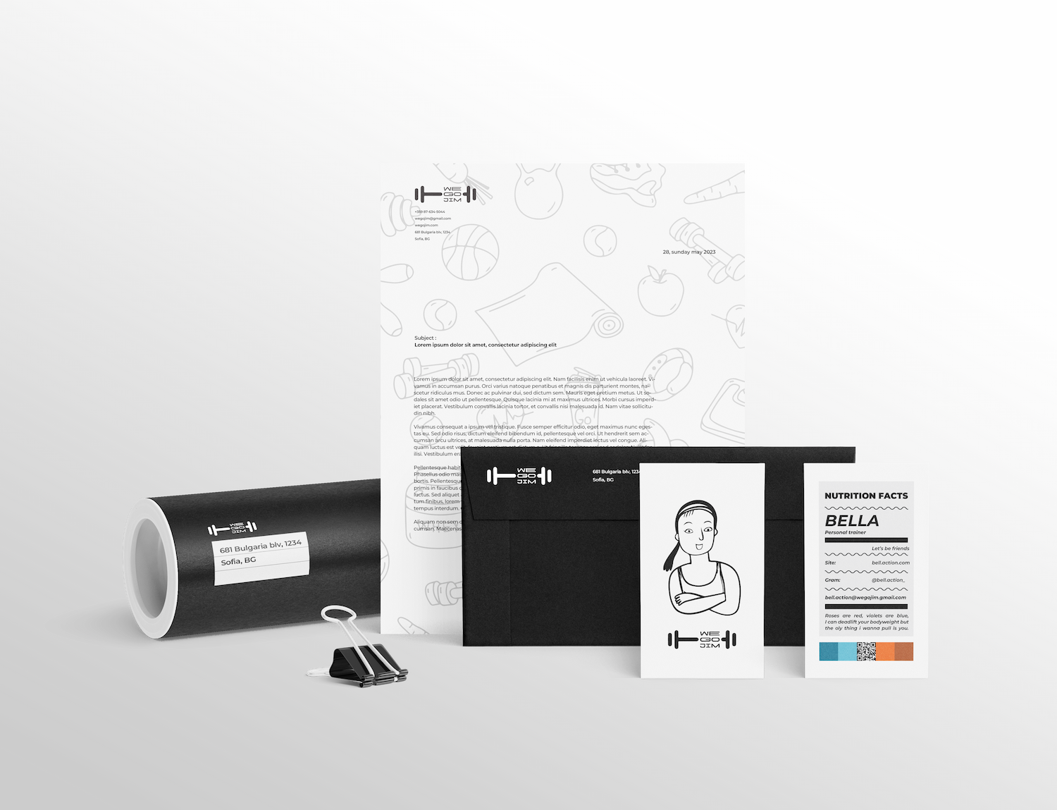
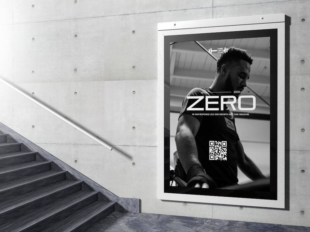
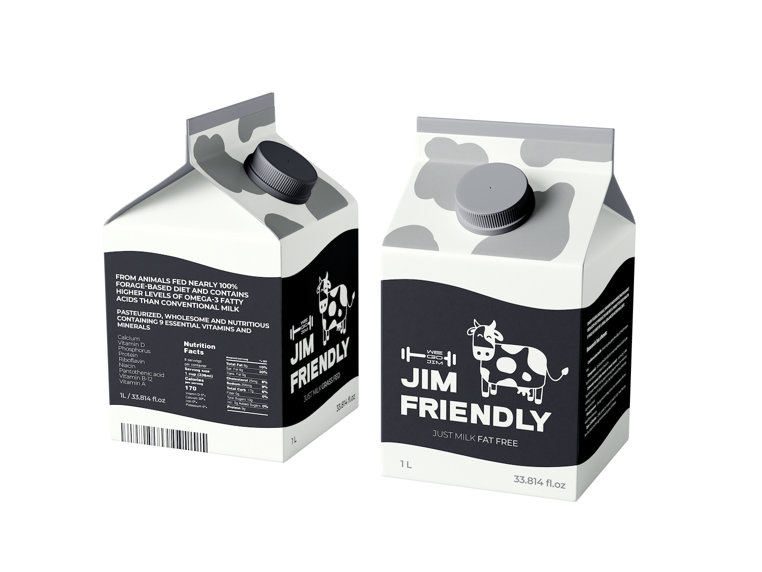
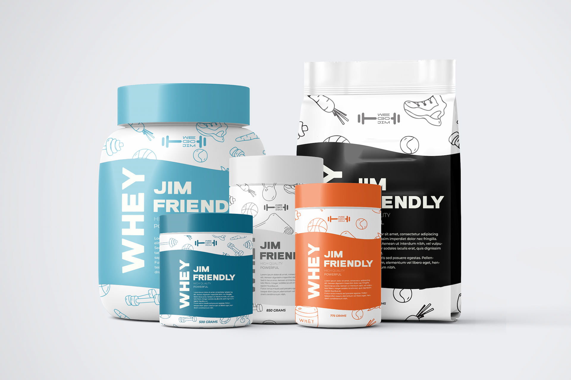
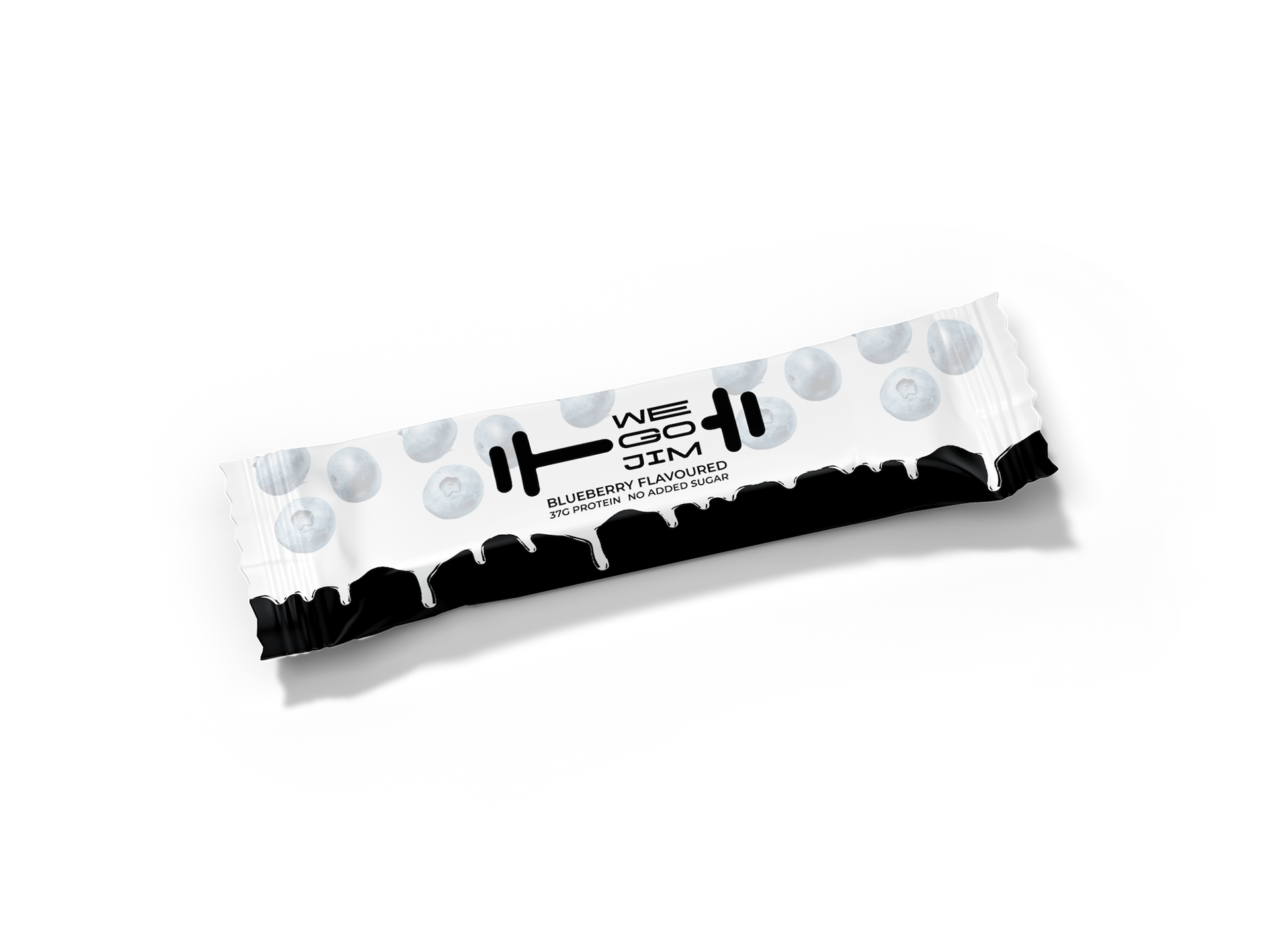
The "WE GO JIM" logo is a minimalist black design on a white background featuring a stylized barbell with the text "WE GO JIM" integrated vertically within it. The clean font and high contrast make it visually impactful and easily recognizable, effectively conveying a message of fitness and community.
COLOR PALETTE
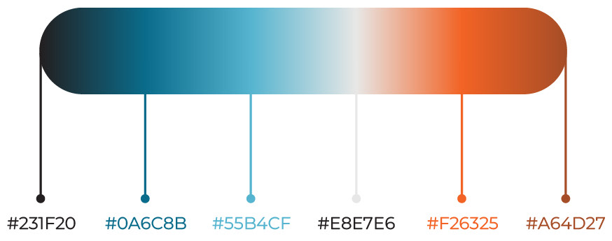
The gym utilizes a color scheme that balances cool and warm tones. Deep and light blues are contrasted with shades of burnt orange, all grounded by an off-white. This palette aims to create a dynamic yet focused environment, with blues potentially fostering concentration and oranges providing energetic vibrancy. The off-white likely acts as a neutral base, allowing the other colors to stand out within the gym space.
TYPOGRAPHY
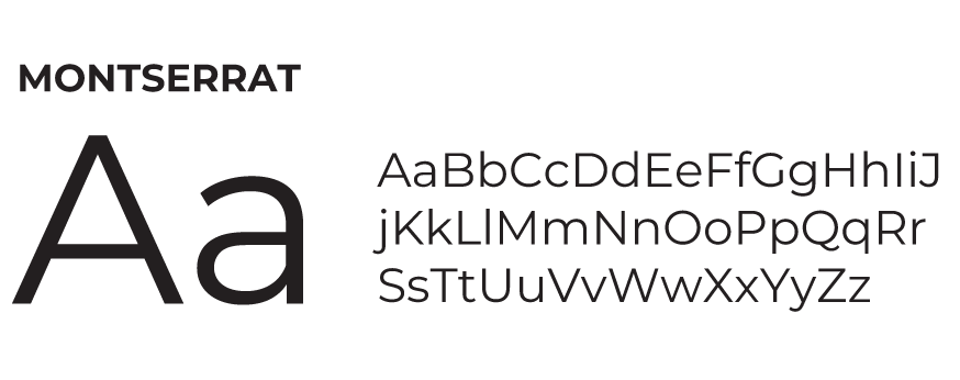
The gym's typography, utilizing the Montserrat font family, likely aims for a modern and approachable aesthetic. As a geometric sans-serif, Montserrat offers a clean and legible appearance suitable for various applications, from headings to body text. Its range of weights allows for visual hierarchy and emphasis, contributing to a well-structured and easily digestible presentation of information. The choice of a contemporary sans-serif aligns with a fitness environment that often emphasizes progress, clarity, and accessibility, making Montserrat a versatile and fitting selection for the gym's branding and communication.